Intra-National Migration, Part 1 - EDA
Exploration Data Analysis

Introduction
What do I do here?
This post is an exploration of the UK intra-migration data. Those are open source data that can be downloaded from ONS. ONS uses the NHS Patient Register Data Service (PRDS) to find out the changes in patients adresses. Since most people change their address with their doctor soon after moving, these data are considered to provide a good proxy indicator of migration.
The migration data is published every year and consist of Origin Local Authority ID, Destination Local Authority ID, sex, age and movement factor field. This movement factor is based on resscaled number of people on the flow.
Please follow ONS to find more information about the methodology.
Why do I do this?
My PhD research is looking at origin-destination flow data and explores Machine Learning modelling possibilities, considering the spatial structure of the flows, including the scale. The ONS migration data is one of the datasets I'm going to use for modelling. Thus, Exploration Data Analysis is a vital process of the reserach.
How?
I'll be looking at
- The nature of the variables
- The structure of the migration in time
- The structure of the migration in space
To do that I need to
- Load the data in and join them all into one dataset
- Make sure we retain the date to look at the timestamp
- Join a spatial information to ensure the validity of all origins and destinations
1. Load the data in and join them all into one dataset + 2. Make sure we retain the date to look at the timestamp
# we will first import all necessary libraries
import pandas as pd
import os
import numpy as np
import glob
import datetime
import datetime as dt
from datetime import datetime
import geopandas as gpd
import matplotlib.pyplot as plt
import seaborn as sns
import plotly.express as px
# set the path
path = r'./../../data/migration'
os.chdir(path) # navigate to path

all_files = glob.glob(path + "/*.csv") # access all the csv files in the folder and create list

li = [] # create empty list

# function which reads each csv, set up same header for each, create a new column with name of each file and store them in a list
for filename in all_files:
    df = pd.read_csv(filename, index_col=None, header=0, names =['OutLA', 'InLA', 'Age', 'Sex', 'Moves'], low_memory=False)
    df['filename'] = filename
    li.append(df)
# rowbind (concatonate) all the csv's in a list together
frame = pd.concat(li, axis=0, ignore_index=True, sort=False)

# seperate just the year from the filename variable
frame['filename'] = frame['filename'].str[23:] # this number depends on how long is your path, this row deletes 23 characters from left
frame['filename'] = frame['filename'].str[:-9] # and this row deletes 9 characters from right

# convert the year to date
frame['filename'] = frame['filename'].apply(lambda x:
                                    dt.datetime.strptime(x,'%Y'))
# rename the date collumn
frame = frame.rename({'filename':'Date'},axis = 1)

# fix the sex column - convert all to binary
frame.loc[frame['Sex']==1,'sex_bin'] = 1
frame.loc[frame['Sex']==2,'sex_bin'] = 2
frame.loc[frame['Sex']=='M','sex_bin'] = 1
frame.loc[frame['Sex']=='F','sex_bin'] = 2
frame['sex_bin'].fillna('Other', inplace=True)
frame['sex_bin'] = frame['sex_bin'].astype(int)
# set the path
path = r'./../../../post/migration'
# fix the path
os.chdir(path) # navigate to path
# Write the cleaned dataset to back it up if we need
# frame.to_csv(index = False , path_or_buf = './../../data/migration/full_migration.csv')
# now I just create a backup in the environment so I don't need to go through all the steps above in case I do something wrong
df = frame
df = df.set_index('Date') # set the date as an index
df.head(3) # look at the first 3 rows
| OutLA | InLA | Age | Sex | Moves | sex_bin | |
|---|---|---|---|---|---|---|
| Date | ||||||
| 2011-01-01 | E09000001 | E09000002 | 27 | 2 | 0.0002 | 2 |
| 2011-01-01 | E09000001 | E09000002 | 36 | 1 | 0.0004 | 1 |
| 2011-01-01 | E09000001 | E09000002 | 26 | 2 | 0.0004 | 2 |
You can see how the data looks like here. There is 7 collumn, from which 1st is the date, 2nd and 3rd retain the ID of the Origin and Destination Local Authority. There are two demographic variables, age and sex. The sex_bin is the sex variable in binary format, as the original variable was combination of Binary and characters. Most important variables is the ‘Moves’ that represents the amount of moves in one flux. By flux, I mean unique flow defined by the combination of Origin, Destination, Date, Age and Sex.
From the cell below you can see that the dataset has 11 milion rows combining the migration data from 2011 till 2018.
df.info()
<class 'pandas.core.frame.DataFrame'>
DatetimeIndex: 11575714 entries, 2011-01-01 to 2018-01-01
Data columns (total 6 columns):
OutLA      object
InLA       object
Age        int64
Sex        object
Moves      float64
sex_bin    int32
dtypes: float64(1), int32(1), int64(1), object(3)
memory usage: 574.1+ MB
# Use seaborn style defaults and set the default figure size
sns.set(rc={'figure.figsize':(10, 4)})
# Plot the moves as a time series
df['Moves'].plot();
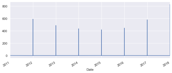
Well that is not very pretty. As the date of the flow is always the 1st day of the 1st month, the time series expect that the rest of th month is zero and show that on the graph. To avoid that, let's try group the values by year.
# create new variable with grouped values
yearly = df.groupby(df.index).mean()
# use the same plot as before
sns.set(rc={'figure.figsize':(10, 4)})
yearly['Moves'].plot();
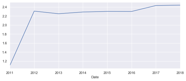
This looks like the first recorded year 2011 had less then half of the migration flows as the years after. This could be very much true, but lets have a look at the plot witout the 2011.
# create new variable with grouped values
yearly = df.groupby(df.index).mean()
yearly = yearly[1:8] # remember the first row has index 0
# use the same plot as before
sns.set(rc={'figure.figsize':(8, 4)})
yearly['Moves'].plot();
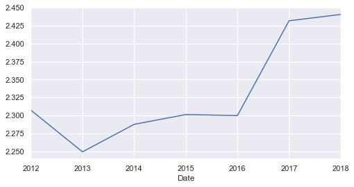
Other than very low migration rate in 2011, there is a certainly an overall increase of the migration between 2016 and 2018.
We can have a look at the distribution of genders in the migration flows.
# get percentages of each gender throughout the dataset
sb = df['sex_bin'].value_counts(normalize = True)
# create dataframe
sb = pd.DataFrame(sb)
# rename the value collumn
sb = sb.rename({'sex_bin':'percentage'},axis = 1)
# create new value for sex column
sex = ['Female', 'Male']
# add the new column to dataframe
sb['sex'] = sex
# change index for the new column
sb = sb.set_index('sex')
# see how the table looks like
sb
| percentage | |
|---|---|
| sex | |
| Female | 0.506348 |
| Male | 0.493652 |
ax = sb.plot(kind='bar', title ="Gender structure", figsize=(5, 3), legend=False, fontsize=12)
ax.set_xlabel("Sex", fontsize=12)
ax.set_ylabel("Percentage from all flows", fontsize=12)
plt.show()
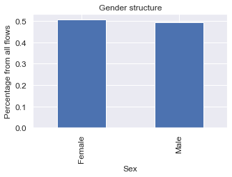
Looks like there is slightly more women than men moving within the UK. Is it true for all of the years?
# group by the date and sex
sb_year = frame.groupby(['Date', 'sex_bin'])
# create variable from the grouping
sb_year = sb_year.size()
# create dataframe
sb_year = pd.DataFrame(sb_year)
# rename the value collumn
sb_year = sb_year.rename({0:'frequency'},axis = 1)
# create new value for sex column
sex = ['Male', 'Female','Male', 'Female','Male', 'Female','Male', 'Female','Male', 'Female','Male', 'Female','Male', 'Female','Male', 'Female']
# add the new column to dataframe
sb_year['sex'] = sex
# reset index
sb_year = sb_year.reset_index()
sb_year
| Date | sex_bin | frequency | sex | |
|---|---|---|---|---|
| 0 | 2011-01-01 | 1 | 1233198 | Male |
| 1 | 2011-01-01 | 2 | 1241611 | Female |
| 2 | 2012-01-01 | 1 | 611320 | Male |
| 3 | 2012-01-01 | 2 | 625818 | Female |
| 4 | 2013-01-01 | 1 | 616615 | Male |
| 5 | 2013-01-01 | 2 | 634451 | Female |
| 6 | 2014-01-01 | 1 | 635949 | Male |
| 7 | 2014-01-01 | 2 | 656613 | Female |
| 8 | 2015-01-01 | 1 | 632116 | Male |
| 9 | 2015-01-01 | 2 | 651020 | Female |
| 10 | 2016-01-01 | 1 | 632000 | Male |
| 11 | 2016-01-01 | 2 | 650336 | Female |
| 12 | 2017-01-01 | 1 | 673271 | Male |
| 13 | 2017-01-01 | 2 | 698670 | Female |
| 14 | 2018-01-01 | 1 | 679906 | Male |
| 15 | 2018-01-01 | 2 | 702820 | Female |
fig, ax = plt.subplots(figsize=(12, 8))
x = np.arange(len(sb_year.Date.unique()))

# Define bar width. We'll use this to offset the second bar.
bar_width = 0.4

# Note we add the `width` parameter now which sets the width of each bar.
b1 = ax.bar(x, sb_year.loc[sb_year['sex'] == 'Male', 'frequency'],
            width=bar_width, label = 'Man')
# Same thing, but offset the x by the width of the bar.
b2 = ax.bar(x + bar_width, sb_year.loc[sb_year['sex'] == 'Female', 'frequency'],
            width=bar_width, label = 'Woman')

# Fix the x-axes.
ax.set_xticks(x + bar_width / 2)
ax.set_xticklabels(sb_year.Date.unique(), rotation=45)

# Add legend.
ax.legend()

# Axis styling.
ax.spines['top'].set_visible(False)
ax.spines['right'].set_visible(False)
ax.spines['left'].set_visible(False)
ax.spines['bottom'].set_color('#DDDDDD')
ax.tick_params(bottom=False, left=False)
ax.set_axisbelow(True)
ax.yaxis.grid(True, color='#EEEEEE')
ax.xaxis.grid(False)

# Add axis and chart labels.
ax.set_xlabel('Year', labelpad=15)
ax.set_ylabel('Count', labelpad=15)
ax.set_title('UK Intra-Migrants by the gender', pad=15)

fig.tight_layout()
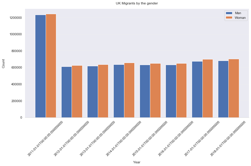
It is definitely true that more woman move within UK than man, even for each year.
Bellow you can see how the difference between the genders differ in each year.
# separate the Males and Females into seperate datasets
M = sb_year.loc[sb_year['sex'] == 'Male']
F = sb_year.loc[sb_year['sex'] == 'Female']
# merge those two datasets
X = M.merge(F, left_on = 'Date', right_on = 'Date')
# calculate difference between males and females
X['Diff'] = X['frequency_y'] - X['frequency_x']
# choose just desired columns
XX = X.loc[:,['Date','Diff']]
# plot the time-series of the gender difference
sns.set(rc={'figure.figsize':(8, 4)})
XX['Diff'].plot();
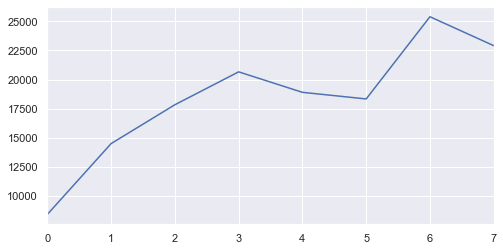
Wait a second …
It looks like in 2011, the frequency of the flows is much higher than all the other years, however, from the graphs above showing the ‘Moves’ factor, we know that the 2011 actually has visibly lower movement factor. In other words, although the 2011 has the most amount of unique fluxes, the amount of people moving is much lower than in recent years.
This is an interesting discovery, but what could be a cause?
- Any change in methodology between 2011 and 2012.
- Differences in the structure of the data before and after 2011
- Change in the nature of the data. I could be that people changed their behaviour pattern.
- Could it be any mistake from my side?
Let's investigate all options.
- Changes in the methodology
The only change in methodology found in the methods guide is this;
“For the mid-2012 to mid-2016 internal migration estimates we improved our methods by linking the health registration data with data from the Higher Education Statistics Agency (HESA). The HESA data showed where students were registered by their university as living, and this allowed us to make more accurate estimates of people moving to study in each area."
- Difference in the data structure
From the download site we can see that the 2011 dataset is the only one that has 3 parts, it has the highest number of rows (unique fluxes). It contains 2.47 milion records, which is almost half as much as 2018 dataset with its 1.38 milion records.
Is it that the 2011 dataset contains more areas than the later one?
3. Join a spatial information to the data
Let's join in a spatial data to see it on a map. There are several datasets that could be used for this, for example ONS LA lookup.
# set the path
file = r'./../data/Local_Authority_Districts_December_2017_Full_Clipped_Boundaries_in_Great_Britain/Local_Authority_Districts_December_2017_Full_Clipped_Boundaries_in_Great_Britain.shp'
# read the file in
la = gpd.read_file(file)
# show the map
la.plot()
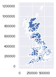
# look at the data
la.head()
| objectid | lad17cd | lad17nm | lad17nmw | bng_e | bng_n | long | lat | st_areasha | st_lengths | geometry | |
|---|---|---|---|---|---|---|---|---|---|---|---|
| 0 | 1 | E06000001 | Hartlepool | None | 447157 | 531476 | -1.27023 | 54.676159 | 9.355951e+07 | 71707.407523 | (POLYGON ((447213.8995000003 537036.1042999998... |
| 1 | 2 | E06000002 | Middlesbrough | None | 451141 | 516887 | -1.21099 | 54.544670 | 5.388858e+07 | 43840.866561 | (POLYGON ((448958.9007000001 521835.6952999998... |
| 2 | 3 | E06000003 | Redcar and Cleveland | None | 464359 | 519597 | -1.00611 | 54.567520 | 2.448203e+08 | 97993.391012 | (POLYGON ((455752.6002000002 528195.7048000004... |
| 3 | 4 | E06000004 | Stockton-on-Tees | None | 444937 | 518183 | -1.30669 | 54.556911 | 2.049622e+08 | 119581.595543 | (POLYGON ((444157.0018999996 527956.3033000007... |
| 4 | 5 | E06000005 | Darlington | None | 428029 | 515649 | -1.56835 | 54.535351 | 1.974757e+08 | 107206.401694 | POLYGON ((423496.602 524724.2984999996, 423497... |
# create point dataset of the LSOA centrooids
# copy polygons to new GeoDataFrame
points = la.copy()
# change the geometry
points.geometry = points['geometry'].centroid
# same crs
points.crs = la.crs
# lets reproject the data too
points = points.to_crs({'init': 'epsg:4326'})
# change projection
la = la.to_crs({'init': 'epsg:4326'})
# cut out unnecessary columns
points = points.loc[:,['objectid','lad17cd', 'lad17nm', 'geometry']]
points.head()
| objectid | lad17cd | lad17nm | geometry | |
|---|---|---|---|---|
| 0 | 1 | E06000001 | Hartlepool | POINT (-1.259479894328456 54.66947264221945) |
| 1 | 2 | E06000002 | Middlesbrough | POINT (-1.222265950359884 54.54199624640567) |
| 2 | 3 | E06000003 | Redcar and Cleveland | POINT (-1.020534867661266 54.55159000727666) |
| 3 | 4 | E06000004 | Stockton-on-Tees | POINT (-1.332307567288941 54.56157879321239) |
| 4 | 5 | E06000005 | Darlington | POINT (-1.552585765196361 54.54869927572448) |
Now we need to create lists of the values in the LA ID columns to
# create list of unique LA id's from each dataset
x = list(df['OutLA'].unique())
d = list(points['lad17cd'].unique())
# chck if the number of LA codes matches
len(x) - len(d)
19
There is indeed some LA's that we don't have a spatial information for. Let's filter them out.
# lets get rid of the rows we dont have spatial information for, based on origins
df2 = df.loc[df['OutLA'].isin(d)]
len(df) - len(df2)
433719
# Do the same thing for the destination
df3 = df2.loc[df2['InLA'].isin(d)]
len(df) - len(df3)
874611
According to this we have filtered out all together 874 thousand record that could not be found in the spatial dataset.
Let's write both datasets into a folder for further use.
Explore rest of the variables
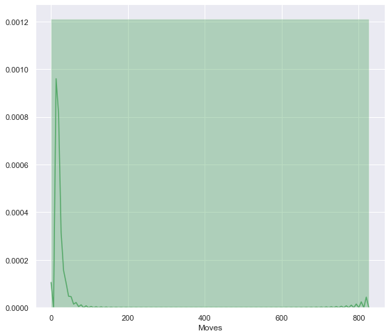
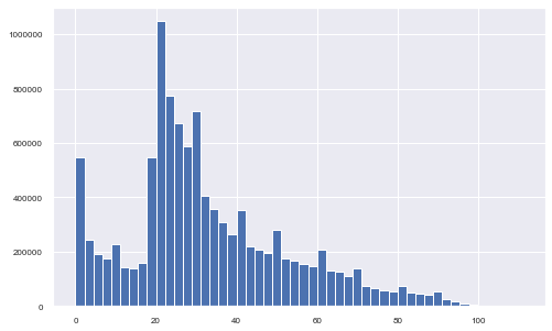
The main variable in the migration flows is the ‘Moves’ which describes the intensity of the flow or the amount of people on the flow.
From the historam below, we can see that most of the flows has a volume between 0 and circa 70. Thise are the less intensive flows, although the most frequent. However, little peak can be seen on number 800; high intensity flows that are less frequent.
plt.figure(figsize=(9, 8))
sns.distplot(df3['Moves'], color='g', bins=1);
The last variable is the age of the migrants. From the histogram below, it is clear that most of the migrating population is aged between 20 and 40. A little peak is also visible for the early age of 0 to 2 years old.
df3['Age'].hist(figsize=(8, 5), bins=50, xlabelsize=8, ylabelsize=8);
Can we do histograms of age by each year?
The order of the years is as follows;
| 2011 | 2012 |
|---|---|
| 2013 | 2014 |
| 2015 | 2016 |
| 2017 | 2018 |
df4 = df3.reset_index()
# plot all the histograms alligned, with same y axe limit, to ensure we can compare them
f, axes = plt.subplots(4, 2, figsize=(15, 20), sharex=True)

sns.distplot( df4['Age'].loc[df4['Date'] == '2011-01-01'] , color="skyblue", label="2011", ax=axes[0, 0]).set_ylim(0,0.06)
sns.distplot( df4['Age'].loc[df4['Date'] == '2012-01-01'] , color="blue", label="2012", ax=axes[0, 1]).set_ylim(0,0.06)
sns.distplot( df4['Age'].loc[df4['Date'] == '2013-01-01'] , color="purple", label="2013", ax=axes[1, 0]).set_ylim(0,0.06)
sns.distplot( df4['Age'].loc[df4['Date'] == '2014-01-01'] , color="darkred", label="2014", ax=axes[1, 1]).set_ylim(0,0.06)
sns.distplot( df4['Age'].loc[df4['Date'] == '2015-01-01'] , color="red", label="2015", ax=axes[2, 0]).set_ylim(0,0.06)
sns.distplot( df4['Age'].loc[df4['Date'] == '2016-01-01'] , color="chocolate", label="2016", ax=axes[2, 1]).set_ylim(0,0.06)
sns.distplot( df4['Age'].loc[df4['Date'] == '2017-01-01'] , color="darkorange", label="2017", ax=axes[3, 0]).set_ylim(0,0.06)
sns.distplot( df4['Age'].loc[df4['Date'] == '2018-01-01'] , color="gold", label="2018", ax=axes[3, 1]).set_ylim(0,0.06)
(0, 0.06)
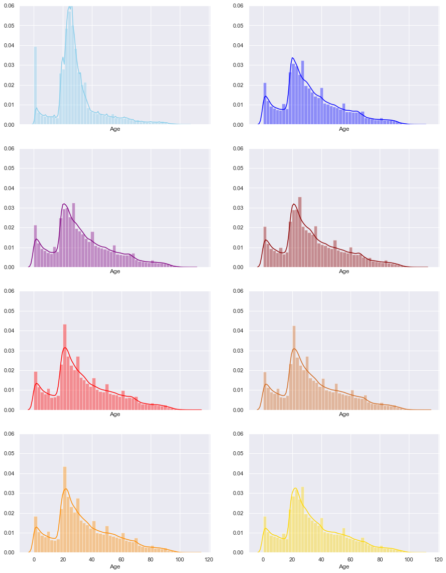
Even here we can see that the 2011 have significantly different pattern from all the other years.
To sum up this issue, we know that:
- the 2011 has more flows
- the 2011 has les volume of people on flows
- has very different pattern in both Age and gender
- there might have been changes in the methodology, but we cannot find exactt description of the changes
This leads tho a decision to exclude the 2011 data in future analysis. Data with significantly different pattern without justified reasons would majorly affect the modelling and the results.
## Maps of Origins and destinations
# extract the long and lat from geometry into separate columns
points['lon'] = points.geometry.x
points['lat'] = points.geometry.y
# join the spatial points to the data, first for the OutLA and secondly for the InLA
outla = points.merge(df3, how = 'right', left_on = 'lad17cd', right_on = 'OutLA')
inla = points.merge(df3, how = 'right', left_on = 'lad17cd', right_on = 'InLA')
# Setup figure and axis
f, ax = plt.subplots(1, figsize=(9, 9))
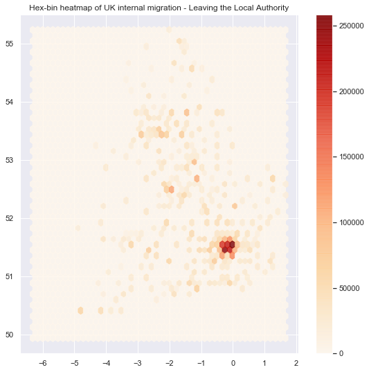
# Add hexagon layer that displays count of points in each polygon
hb = ax.hexbin(outla.geometry.x, outla.geometry.y, gridsize=50, alpha=0.8, cmap='OrRd')
# Add title of the map
ax.set_title("Hex-bin heatmap of UK internal migration - Leaving the Local Authority")
# Add a colorbar (optional)
plt.colorbar(hb);
# Setup figure and axis
f, ax = plt.subplots(1, figsize=(9, 9))
# Add hexagon layer that displays count of points in each polygon
hb = ax.hexbin(inla.geometry.x, inla.geometry.y, gridsize=50, alpha=0.8, cmap='OrRd')
# Add title of the map
ax.set_title("Hex-bin heatmap of UK internal migration - Moving to Local Authority")
# Add a colorbar (optional)
plt.colorbar(hb);
<matplotlib.colorbar.Colorbar at 0x24c9186ccc8>
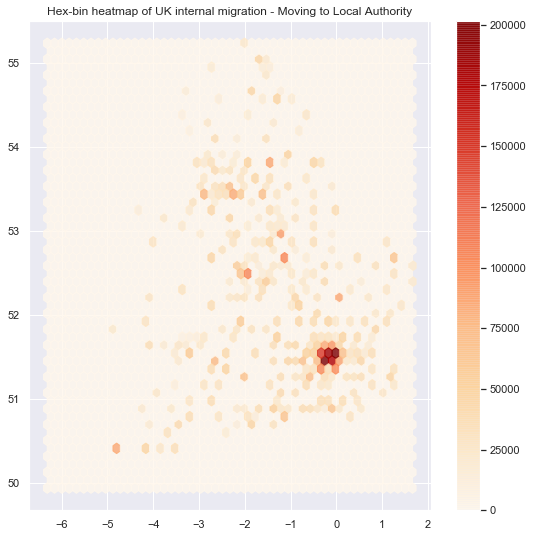
Although the heatmaps are quite easy maps to show, it is one of the worst choices one can make. You can read more about the heatmap issue here. In short, the issue is in the way our brains percieve the shading of the colors, this is also called the checker shadow illusion.
In Part 2 I'll look more closely at the spatial structure using R and start some modelling.
# for that I just need to export the data I munged here, to use them later.
# df3.to_csv(index = False , path_or_buf = './../data/migration/munged/full_migration.csv')
# points.to_file(driver = 'ESRI Shapefile', filename = './../data/migration/munged/LAcentrooids.shp')