Global Food Hazard Network
Interactive map with Kepler.gl.
Food hazards from around the world
This post is based on the initiative from the Jean Golding Institute (JGI) and Food Standard Agency (FSA). The challenge is to provide a visualization that would potentially identify hazards before they can be bought by consumers.
From the challenge description, I got tempted by one of the questions ‘Can we detect any consistent patterns in the way alerts move across countries?’ I will give you some basic information about the phenomena, the data, and guide you through my thinking process behind the visualizations I created.
According to USDA, food hazard ‘is defined by FSIS HACCP as any biological, chemical, or physical property that may cause a food to be unsafe for human consumption.' The FSA data is a collection of global food hazards since 2015, and contains much information such as dates, places, types and further description. Most importantly, the data is in a form of flows from origins to destinations. Here origins are the countries in which the food hazard sources and destinations are countries in which the food hazard was identified. This way I could construct a spatial flows of food hazards.
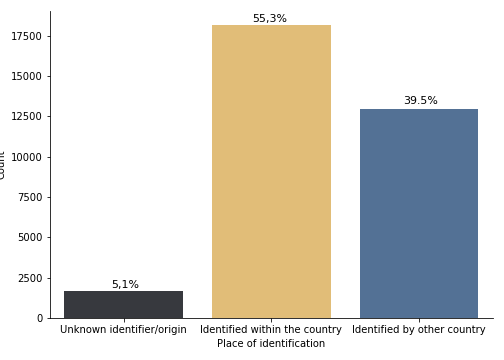
I noticed that a big amount of food hazards originates and is identified within the same country. The first graph shows you the proportion of those flows (55.3%) as well as those that are identified by other countries (39.5%) or by unknown identifier (5.1%), which could be just an anonymous identifier.. I am really interested in what does this really mean?
On the next graph, you can see the exact numbers of food hazard sourcing in a specific country and fall into one of the previous categories. Interestingly, some countries have a higher proportion of identified food hazards by unknown identifier than the others. The United States, for example. Food hazards originating in the UK are mainly identified in the country.
This can be compared with the next graph that shows the other side, the countries in which the food hazard was identified and the proportions of the same classes. In this case, food hazards have an unknown origin. UK has a higher proportion of identified food hazards from other countries than originating food hazards identified by others. It also identified 17 food hazards that do not have known origin.
Finally, I have constructed a network from the food hazard flows, in mathematics, this is called a graph. Graphs/ networks can be also used for the analysis of its components. I have looked at one of those and defined the importance of each country for the food hazard network. You can see a Rank of importance I included in the popup for the countries. You can also compare this rank with the Food Safety and Quality Rank based on GFSI (Global Food Security Index).
Interestingly, several countries stand out with their pattern. For example, have a look at China, which seems to originate very little food hazards, given the population size, the food safety and quality rank (interactive map) that is lower than you would expect in that case and the common knowledge connected to China. I mean, we all saw several instances in past decades when there was a disease outbreak originating in China, caused by wild animal consumption (aka situation around coronavirus). The Food hazards that originate in China are mainly only identified by other countries. Furthermore, China has no records of identifying global food hazards. I would be interested in further investigation of this because there could be multiple explanations. Most likely, it could be a result of the political system and relaxed law and culture, that could be either not publishing the internal food hazards or simply just do not even record them. It could also be that the food safety system is not on a level that they are able to detect global food hazards. I am only saying this, because several countries follow the same pattern, such as Turkey, Brazil, India, Vietnam or Thailand. However, those are only conspiracies. Drop me a message on twitter if you know of any articles or books that can explain such phenomena.
There is something suspicious also on the USA, just look at the number of food hazards originating in the USA and having an unknown identifier, like someone does not want to be seen as the enemy. Well, drop me a message again if you have any thoughts on that.
Last note, this post is built with plotly, which is an interactive graph library and kepler.gl, which is an open source geospatial analysis tool for large-scale data sets. Kepler.gl is super easy to work with, you can use it on it's own, within a python or build from scratch. This way, I am trying to show that valuable insights into the data, does not need a complicated code and that it can be pretty fun to make them.
Thank for reading, I will try to post the code for this soon, so you can see what has been done.